HALON
Background
Halon Security has been providing data security and storage solutions since 2002 ‘…known for its award-winning email security solutions, used by major hosting providers, non-profit and government organisations, municipalities and businesses of all sizes.’ Now the company is heading across the Atlantic, with its first stop being Hostingcon in Austin, Texas.
Mission
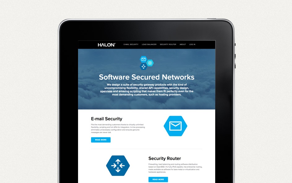
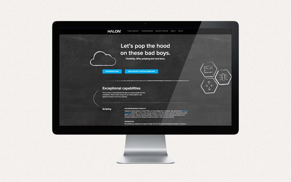
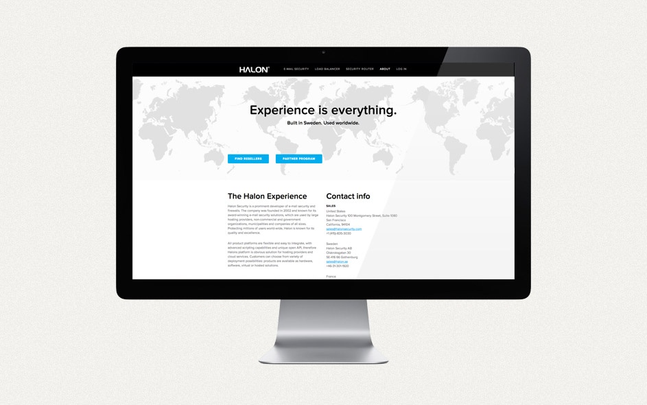
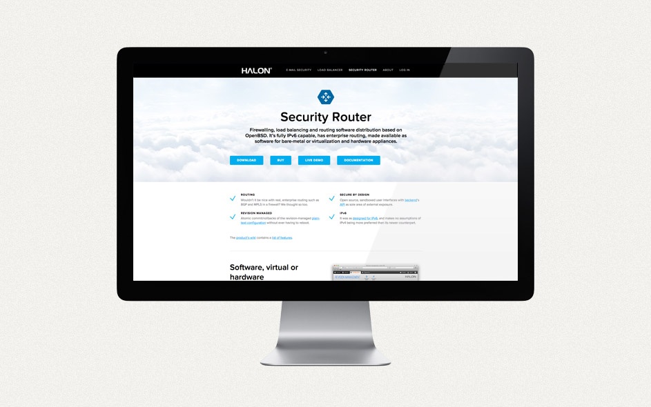
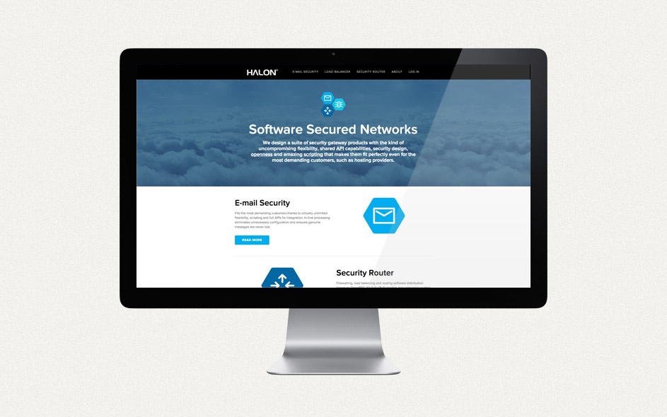
We were commissioned to develop a new graphic profile and website for the US launch. Halon’s three main products: E-mail Security, Secure Load Balancer and Secure Router were to be emphasised as a clear suite. Halon’s existing logo was not to be redrawn, but the graphic profile was to relate to it.
Challenge
An important part of the assignment was to simplify and clarify Halon’s offering. The previous website was bursting with technical information, making it difficult to navigate. What could we strip away and still communicate effectively?
Solution
We conducted a feasibility study to analyse the competition and the environment. Based on this, we presented outline proposals for Halon. Together, we made a selection and came up with a solution-oriented identity that would focus on the results of Halon’s services rather than the external threat. We developed a new iconic language, fonts, colours and graphics and created an identity that exudes confidence, power and flexibility. The starting point for the graphics and icons has been an educational design language that emphasises Halon’s intuitive interface.
Since the launch, Halon has chosen to work on and change the website itself. Therefore, we refer only to the slideshow above for reference.

